A New Interface for Computers
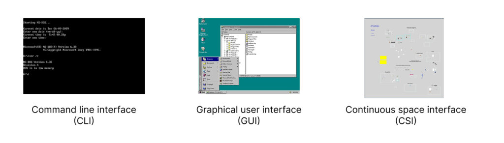
For a long time, there have been only two main ways to interact with a computer screen: command-line interface (CLI) and desktop-based graphical user interface (GUI). I came up with the third one. I call it continuous space Interface (CSI).
What is wrong with desktop-based interface?
Have you ever noticed how awkward it is to navigate your computer? First of all, you don't have enough space. The size of your screen determines how much working space you have.
Everything is crammed into sliding windows that constantly overlap. If you want to view one thing, you have to push something else out of the way. Or you stack windows on top of each other, creating a mess.
Because there is always not enough space, everything is dense. Whenever you need to make a choice, you always have to choose out of 100 items.
- Need to open an app? Here is a list of your 100 apps.
- Need to use a bookmark? Here are 100 bookmarks to choose from.
- Need to find a note? There are countless notes, so you have to use search.
Windows are constantly shifting relative to each other, making it hard to orient yourself. Every time you need to switch contexts, you have to pause and think, How do I get there?
The only thing that remains somewhat stable is the folder hierarchy—which is a nightmare of its own. Humans didn’t evolve to navigate tree structures. It’s an unnatural, abstract way to organize information.
Also, why do we still have to name every file we save? In the real world, you don’t label every piece of paper you set on your desk.
Imposed hierarchies
Apps impose hierarchies that you may not want to use. For example, you may have a certain project in mind. There are things on your computer that belong to that project, like bookmarks, notes, files, etc. But where are they? They are all over the place.
- Bookmarks live in your browser, buried among bookmarks from unrelated projects.
- Notes are trapped in your note taking app.
- Files are hidden somewhere in a folder maze.
Each time you need something, you’re forced to either sift through 100 options or rely on search.
How did we get here?
A lot of these design choices were made when computers were primitive by today’s standards.
- Hierarchical directories? Invented before computers even had screens.
- Desktop-based GUI? Developed in the '70s, when it made sense given the limitations of the time.
Back then, these ideas were practical. Today, they’re just outdated traditions.
We now have computers powerful enough to render entire 3D worlds in real-time—yet we’re still clinging to outdated design principles like folder hierarchies. Instead of designing interfaces that work for us, we keep making things convenient for the computer.
The solution. Continuous space interface
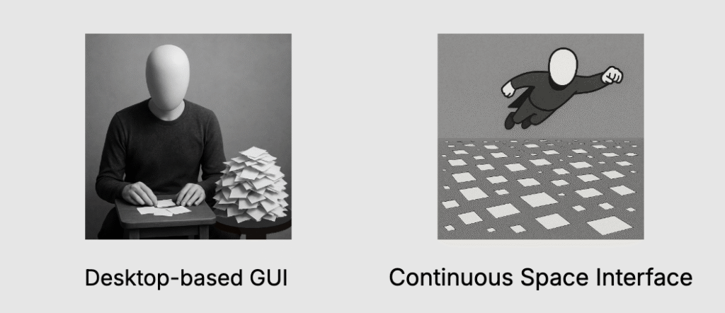
You know what’s easy to navigate? The real world.
In the real world, you don’t shuffle through sliding windows—you place things in space. Related objects are positioned closer together. You don’t need search bars or hierarchical menus to find your stuff. You just know where things are because of spatial memory.
So why don’t computers work the same way?
They can. We already build immersive digital spaces in video games. Imagine an operating system designed like that. Instead of staring at a cluttered desktop, you’d enter a spatial environment—a 2D or 3D space where your data isn’t locked inside folders but arranged visually, like objects in a room.
No more sliding windows—just move through your workspace instead of rearranging it.
No more file names—just like objects in real life don’t need labels, your digital documents can be identified by their location in space.
No more rigid hierarchies—just arrange things in a way that makes sense to you.
You may think that such navigation will be too slow. But in reality it will be like playing a video game on a God mode. There will be all sorts of navigational tricks and shortcuts that will make you navigation super fast while keeping it continuous. You want to avoid 'teleportations' or instant changes in your environment that disorient you.
No imposed hierarchies
In a spatial interface, you control the organization.
Say you’re working on a project. Instead of digging through separate apps, you could have everything—notes, bookmarks, images—right there in one space.
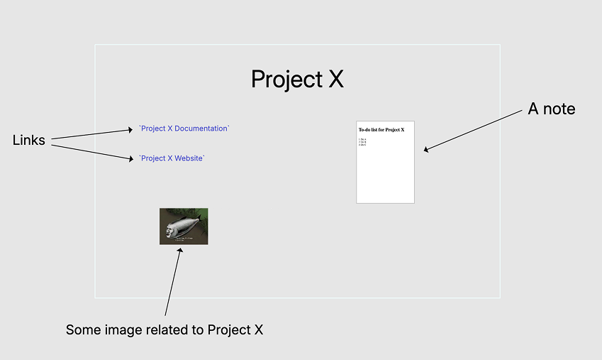
Imagine a simple rectangle representing your project. Inside, you place everything related to it. No more choosing between 100 options or relying on search. Instead, your choices are always visually and spatially obvious.
You can organize your projects the same way, by placing related projects closer together.
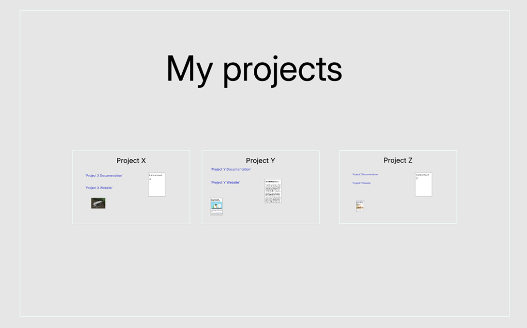
This may remind you of folder hierarchies. But this is a hierarchy that you create. Not something inconvenient that is imposed upon you.
Here is an example of a 3D interface:
How to implement Continuous Space Interface
We don’t need to build an entirely new operating system from scratch. Instead, we can start with an app. While a dedicated OS might be useful in the future, the best way forward is to test the concept in a more controlled way first.
We can also define a limited scope to begin with. The app could handle essential elements like:
- Text documents
- Images
- Links
- File shortcuts
- Lines and arrows
More features can be added later. Do we need spreadsheets? Maybe—but it’s not necessary to include everything from the start.
LZ Desktop
I’ve already built an early version of this concept. I call it LZ Desktop (Large Zoomable Desktop). It’s far from finished, but I released it anyway—because it’s the first step toward building a new kind of web, which I discuss in other posts.
As I continue to improve the app, others can start creating content in new formats that currently only this app understands.
Here is a short video demonstrating some features of this app:
You can download the app here.
How I came up with this idea
I wouldn’t have realized there was something fundamentally wrong with computers if not for Ted Nelson. He started designing interfaces for computer screens before computers even had screens, imagining a world where computers would connect and interlink information seamlessly.
The way I understand his vision, connectivity was meant to be the core feature of computers. You should be able to link and combine pieces of content from different places—whether on your local system or across the network. Instead of isolated files and rigid structures, everything would flow together.
But his ideas didn’t prevail. Instead, computers and the web became highly containerized. Everything is locked inside a box—a file is a container, a web page is a container, an app is a container. The seamless connectivity Nelson envisioned was thrown away, all in the name of security and scalability.
I believe connectivity is too important to sacrifice. There are other ways to ensure security without isolating everything into silos. As for scalability, you don't need to scale everything. The most common actions people take on computers—writing, linking, saving information—could be standardized, eliminating unnecessary variations in how different apps handle the same tasks. There’s no need for every application to reinvent how text is processed or how links are created.
Instead of forcing users to navigate a maze of folders and incompatible tools, we could create an environment where these fundamental actions work seamlessly across the system. For more specialized cases, containers can still be used, but they shouldn’t be the default for everything.
Post scriptum (updated in February 2026)
This post might seem off-topic for this website, which is focused on transforming the Web rather than computer interfaces in general.
Playing with Continuous Space Interface is how I discovered the ways to improve the Web and add visible connections to it. I actually thought that an app with CSI that allows you to download web pages would be a driver of adoption of the new web document formats that I propose on this site. I no longer believe that.
Currently, the main part of my project is the browser extension that allows you to view new document formats with visible connections in your browser. The app is just a nice addition to the infrastructure around these new formats.
So, looking back from February 2026, perhaps this article shouldn't have been published here at all. Still, I’m keeping it — it shows how the idea developed.
Download main documentRecent posts
- List of Parsing Rules
- CONDOC format description
- Parsing rules
- Embedded HDOC format description
- News on the Project
- Revisiting the Web’s Biggest Problem
- Examples of documents with visible connections
- A podcast about CSI and Web 1.1
- My plans for 2025
- URL schemes for Web 1.1
- Republishing on Web 1.1
- CONNECTIONS format description
- The Three Stages of Web Evolution
- Everybody wants to use the New Web
- SDOC format description
- CDOC format description
- HDOC format description
- Publish your website on Web 1.1
- A New Interface for Computers
- Web's biggest problem. Introduction to Web 1.1